In this section:
1. We will introduce the AARRR Startup Metrics coined by Dave Mcclure. This is the best knowledge on understanding how a startup operates and thrives.
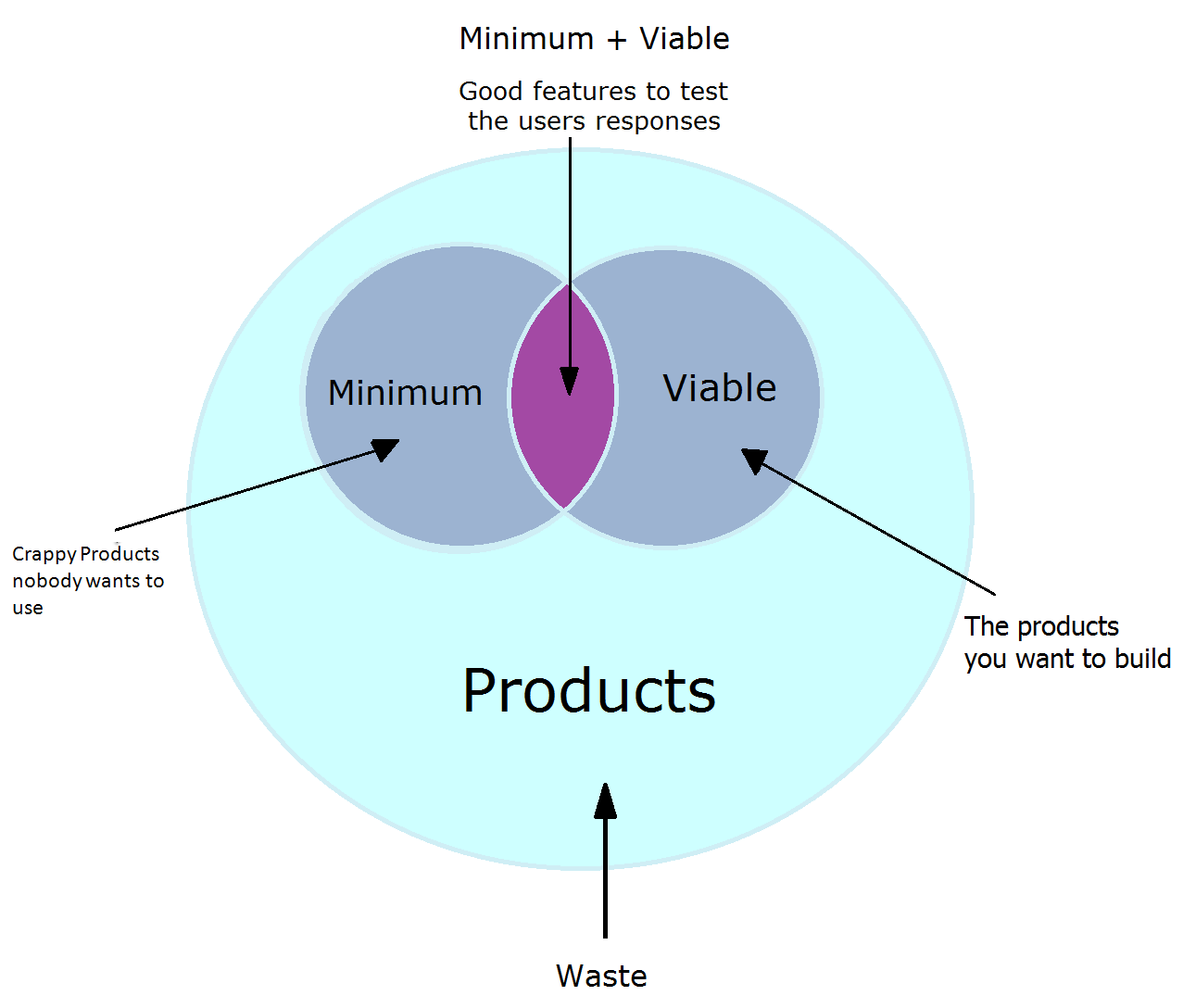
2. We will introduce the MVP (Minimum Viable Product), which is the most concise version of your product that has only the key features needed to successfully deliver your UVP.
3. We will give you some Jedi mind tricks to make users fall in love with your product/company.

This is the AARRR (Must Read!) startup metrics model developed by Dave Mcclure. These 5 metrics represent all of the behaviors of our customers.
We want to break down these 5 metrics on your product and look at them separately, then analyze and monitor them so that we can optimize them. A successful startup is one where they are able to optimize every single one of these 5 metrics.
It's important to understand about AARRR, because only when you understand all the metrics, you will understand where exactly is wrong with your startup, so you don't guess and make the wrong assumptions. When you understand AARRR, you can become a startup doctor, because you will know exactly what or which part is wrong, and then fix it.
For example, a Chinese restaurant owner opens his restaurant in San Jose. After 3 months his business is still quite poor, so he simply blames that people in San Jose don't like to eat Chinese food (impossible!).
The truth is that many startups make the same mistake of thinking if something doesn't work, it must be everything, or they just guess the wrong reason why their business is not working. Like any website or app, a restaurant relies on many things to be optimized. It needs to have a good location. The storefront needs to look good so customers want to go in. When users are in, customers need to feel comfortable with the interior, and they need to be sold on the content in the menu. Moreover, when they go through the menu, they need to feel comfortable with the price point. Also, the user will obviously rate their experience in terms of the service, the taste of the food, etc.
So, while 1 restaurant owner will conclude that people don't like Chinese food. Another store owner that knows AARRR-fu will find out maybe it's because his storefront doesn't look interesting enough, his price point is too high, or what not.
The truth is, any part of a customer's experience and its details from walking pass the storefont, to going inside, finding a seat, ordering, eating, paying, and leaving the restaurant, are all very crucial to the restaurant's business.
Case Study: Michelin 1 star restaurant chain called Ding Tai Fong focuses on every part of the detail. They optimize everything. They are so detailed that when you are paying for the bill, the cash change they give back to you is always new so that you don't get your hands dirty. So they have someone who goes to the bank every morning to get brand new cash to start the day off. It's something as subtle as this, but this way, people love their whole experience from beginning to end and come back again or tell their friends.
Website Case Study: StartitUp is getting 1000 visitors/month (Acquisition), and our Activation (conversion) is 70%, so that we are getting around 700 users/month. Out of those 700 users, only 20% of those users are coming back after their first visit (Retention). Out of those 20% (140 users), only 10% are paying (Revenue), so that we end up with 14 users paying each month. Out of the 700 users, about 10% of those are referring out service to their friends (Referral).

When we look at the example above, we can separate each behavior and try to optimize each separately.
For example:
1. StartitUp has a good Activation (conversion) rate of 70%, which means we are dealing with a real problem and we have a real solution, and we also have a convincing landing page.
2. We want to get more signups, so we look to improve our Acquisition (visitors) by adding more acquisition channels or work on SEO to try to get more users.
3. We then look at our Retention, and saw that our Retention is pretty horrible at 20%, so we build some extra features like email newsletters and gamification to get users to come back so that we have another chance to monetize them. But we realize users are not coming back to our service because our service somehow isn't delivering the value promise we made - it doesn't solve their problem or it's not clear how to use our service. We also create a better tutorial feature to help users get started with the guide so they can properly reap the benefits from StartitUp.
4. We also see that we are not doing a very good job converting users into paying customers (Revenue), so we look at our price structure and our pricing page to see if we are not doing a good job communicating, or if we can build a stronger pricing plan with the main pricing plan that we want people to buy highlighted.
5. Finally, we check to see why we are not being recommdned (Referral) to friends and see if we can put in some social sharing features to increase the number of referrals. This could also be that our service doesn't have any referral value since it's not good enough.
However, for a startup, we don't need to focus on all of the 5 metrics during the MVP (Minimum Viable Product) phase. The 2 most important metrics we want to monitor and optimize right now are Activation and Retention (Retention is King! - If people like using your product and they return to use it, then you will be successful).
These are the 2 main metrics that will determine whether or not you have built a service that people need. A good Activation tells you that your UVP and landing page is convincing and that you successfully get the user to go through with 1 use cycle post logging in. Good Retention tells you that your MVP actually delivers the UVP to the customers.
If you plan to start charging immediately, then Revenue will be one that we want to monitor as well. Acquisition and Referral are not immediate, but they are the engines to drive new customers to your website, so do keep them in mind when building your MVP.
Important: Before you can get good Activation and Retention, which means that you have proven that your product does indeed delivers the UVP, there is no need to start getting users. The reason is because before you are sure that you have a working solution, the users you get now will leave anyways. You will be depleting your users, and it might also give you bad reviews. Therefore, before we can validate your MVP in a later section, only focus on getting "early adopters" and leave the Growth Hacking for later.
See Dave Mcclure's AARRR to learn more: http://www.slideshare.net/dmc500hats/startup-metrics-for-pirates-long-version
A great read to learn about Lean Analytics: http://www.kaushik.net/avinash/lean-analytics-cycle-metrics-hypothesis-experiment-act/
Great Tools to build engagement/gamification:
A MVP (Minimum Viable Product) is a startup philosophy and concept popularized by Eric Ries now widely accepted in the startup community. It’s a way to quickly build a product with the only the features needed and quickly validate it with early adopters to see if your product actually delivers the UVP.
A MVP will include and only include must-have features to solve the #1 problem your product promises to solve. The nice-to-have's and don't-need features are postponed till you've validated that your MVP is a viable solution.
In other words, you must understand exactly what your customers want, and delivery just that. Nothing more, nothing less.
So you want your customers to come, and get exactly what they want so that they will come back. Retention is key, not only because we want them to come back, because we know that we have created a product or service that delivers our solution.
Example: Say you are going to open a coffee shop:
Good MVP: You have a menu with only a few selection of coffee, but all of them taste great. Your shop is clean and tidy with white painted walls and decent looking coffee tables with comfortable seats. Your cashier is polite and you take Visa and Mastercard. No American Express though (we're cool with that).
Bad MVP: You have a menu with a few selection of coffee, but most of them taste horrible. Your shop is below par and your seats are uncomfortable. Also, your store only takes cash and your cashiers are flirting with each other.
Horrible MVP: You have 40 items on your menu - Coffee, frappuccino, espresso, cakes, croissants, biscuits, tea, fried rise, chicken nuggets, etc (you get the idea). You gold plate your store front and your store interior is pimped out with the most expensive furniture and coffee mugs. You put Samsung LCD TVs at every table and the chairs are massage chairs. You take Visa, Mastercard, American Express, and Home Depot gift cards.
We've already asked you to build a service-first product in the last section, but just in case you skipped it, we'd like to mention it here again because we feel this is very important.
Before you go ahead and put yourself in the "build" mentality, I'd like you to slow down and think about whether or not you can deliver your solution without a product (What I'd like to call the 1st version or smaller version of your MVP). This is the easiest way to start your business, and having a business that already makes money already makes your solution valid, even through an online presence.
For instance, if you want to build AirBnB, a marketplace for unused rooms, then what you could do first is not build a whole fully functioning marketplace, but think about something equivalent but smaller.
What you could do is find 10 friends with unused space and are willing to rent that space out. Then you can find travel agencies or put up a simple Wordpress website with the availability and price information on the properties.
What is happening here is that you would have delivered your solution on a smaller scale, made some money, and have validated your solution. At this point, it'd be very easy to move forward with more confidence to build the full "automated" version, or to get funded to build it.
Once you have a business that is making money, there will just be a lot more confidence to invest more into it, whether by you, by a technical co-founder, or by investors.
Recommended Read: http://benogle.com/2013/03/25/an-idea-for-non-technical-founders-service-first-business.html
While designing a website is very much about the interface and how to "guide" your users to do what you'd like them to do or click on, a lot of it is actually creating an "experience".
In this generation, we've moved from just having a usable and functional product, to a product that is not only user-friendly, but a product that connects with you - a product that you feel defines you, or you have feelings for.
Also, people don't always do what you want them to do. Asking is not always enough to get people to do what you want them to do. How do you get them to complete their profile? or how do you get them to complete the sale on the order check-out page?
Below are a few tricks that can transform your website to an "Experience":
1. Pictures of People: Put pictures of people on your website, and don't just use any random looking stock images (that'll actually make it worse). And studies show that not only pictures of people on your website convert better, but if those people in the pictures are looking towards the button or the Call-to-Action link/button you want them to click on, then that would convert even better. Read here: http://uxdesign.smashingmagazine.com/2009/09/24/10-useful-usability-findings-and-guidelines/

Compare this with the image below:
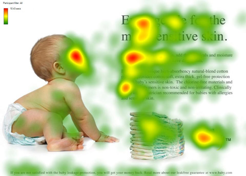
Where the baby is looking gets a lot more eyeballs than the one that's just making eye contact with you. Turns out that e-EyeContact is overrated.
2. Mascots: Companies like Mailchimp have done very well by using a mascot that makes it really easy to remember them by, and hard to forget. Mailchimp uses well, a monkey. Twitter uses a whale. Hootsuite uses an owl. The list goes on. See more here: http://www.hongkiat.com/blog/21-excellent-examples-of-animal-as-web-mascots/

3. Gamification/Sense of Completion/Collecting Things: Human beings love to complete, collecting, and be rewarded. When you think about the structure of your website, you can think about creating gamifying elements like giving users badges when they achieve something.
You can also implement elements like ranking, levels (e.g. New Member, Senior Member, Guru Member, etc.) , positions, etc.
Case Study: Linkedin had a lot of trouble in the beginning to make people fill out more than just their name in their profiles. Then, they decided to come out with a profile completion bar that makes them want to fill out more. Obviously, they were wildly successful. They were able to get most people to fill out more information about themselves.

Case Study 2: Nike's Nike+ app on iOS and Android is an app that helps you track your running habit and progress. To make things "fun", they also gave you an avatar or a doll that you can customize to look like yourself. The cool thing is that if you didn't exercise enough, your avatar (which represents you), would get fat and that would make you want to exercise again just to keep your virtual self in shape.

The take-away here is that you want to create an environment that encourages your users to take the actions you want them to take, because simply asking is not enough. In fact, as a manager who's managed tens of people, the best way is not to micro-manage or "instruct" them to do what you want them to do (you can't anyways), but to hack people's behavior by cultivating an amazing culture, putting in an efficient structure, delivering clear communication, and creating mutually beneficial incentives to make your staff happy, prioritized, and productive - without much of your intervention.
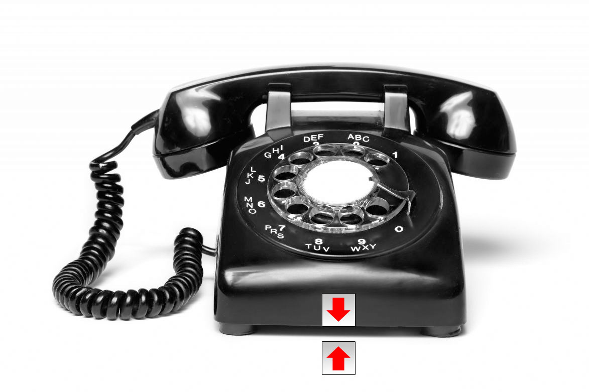
Case Study (Mind-blowing - I can't find the video for this one, but I've photoshopped an image to demonstrate): I watched this video in Tokyo once about how a Japanese boss mind-controlled all of his employees with little square stickers.
So, the story was that the stuff in the office were not being organized and put back after use. So, the boss was quite a neat freak and wanted things in order.
He first simply asked the employees (nicely) to put things back. Didn't work. He then put in a policy of reward and punishment. Didn't work either. In the end, what he did was he stuck on every office tool or object a white sticker with a red arrow on it pointing to its counterpart, which would be stuck on the precise location where the item should be returned after use (like below). When the object is returned to its original location, the arrow would point perfectly to the arrow on the table or on whatever piece of furniture.
The employees all responded that in the beginning they didn't mind it much, but as time passed, it actually frustrated them that the arrows weren't lining up. Sooner or later it became a habit and everyone was playing the "arrow matching" game in the office.
4. Mystery/Surprises: Kinder's Surprise (Chocolate Candy) makes you want to buy a chocolate because you don't know what you're going to get. Actually, many websites do this. Other than mysterious, you can also be unpredictable. People like surprises.
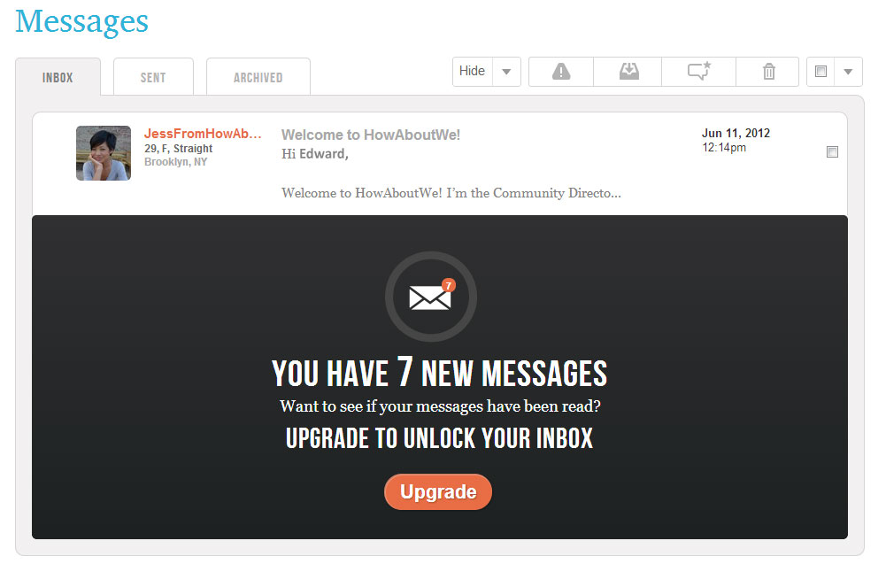
Case Study on Mystery: Howaboutwe is a dating website where you'd post a date idea and whoever is interested can contact you to join you on that date (so dating based on mutual interests). However, while you are free to create a profile and post your date ideas, you cannot read any of the messages sent to you if you don't become a paid member. So, they make it a mystery about who could potentially be your other half. It'd drive a single person insane if he/she couldn't find out what they're missing out on. Naturally, Howaboutwe is doing great, because their mystery element is off the charts.
Case Study on Mystery: HotWheels tested out having a Mystery car toy against just showing what the car is. Obviously, the mystery car sold significantly better than when they had shown the car. Even kids couldn't handle the suspense.

Cast Study on Surprise: For those of you who played Diablo 3, you noticed that Diablo 3 was a lot less addtive than it's predecessor. Most people probably didn't notice why, but the reason was because Diablo 3 was dropping too many rare and unique items whereas Diablo 2 didn't drop as many. In Diablo 3, it became easy to predict when you will get a very good item, and in Diablo 2, it was actually quite hard to plan the same acquisition. Therefore, in Diablo 2, you could go on for months or even years because 1. It was hard to get great items (if you got one you're special), and 2. You feel like if you stopped now, the next kill will drop a rare item - so you keep chasing after that carrot. Read here to find out why Diablo 3 wasn't addictive.
5. Availability/Ego (Social Status): This is quite a well-known tactic, but also one of the best. However, what this really is, is actually just another way to stroke one's ego. Everybody wants to be first or one of the few owners. It defines who they are. Making your service or product limited in quantity makes it seem a lot more precious and rewarding.
In fact, an experiment studied 2 groups of people that paid different prices on a product and found that while both groups bought the same product, the group that paid for the higher price enjoyed a higher level of satisfaction. Therefore, price is also an important element that creates a sense of "ego" for your customers.
Case Study: Hermes bags are perhaps the most expensive bags in the world. One usually costs over USD$10,000, and that's if you can get on the waitlist. So, the truth is that Hermes is not a bags' company. They are a confidence feel-good I'm-the-shit product company. They create bags that make ordinary women into superwomen. A woman is only as precious as her bag. Right?..Right?
If I didn't tell you there's only 10 of these in the world, and you'd have to be a superstar to hold one of these, would you still want it so badly?
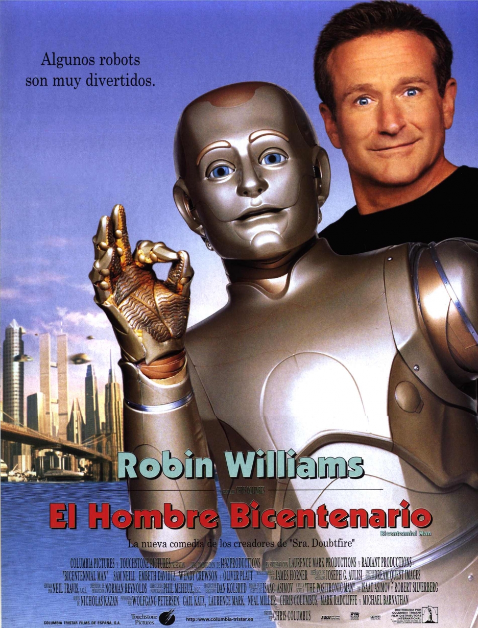
6. Be Human (and Humorous): As mentioned, a key thing to do for your website or product is to make it seem like a "human". If you've seen the Bicentennial Man by Robin Williams, you will see that in the film while most robots are seen as robots because they have no humanly emotions, the robot played by Robin Williams was different (humanly) and had emotions. Apparently, being human is so hot. In the movie, he was not only able to make 1 woman, but 2 women fall deeply in love with him.
And, whatever made him so loveable in the movie was his humor. If you can make people smile, laugh, or cry, then they will come back. They will not only come back, but bring their friends.
Our website is very international
Case Study: Apple is a master of emotional design and marketing. For example, the way you know if your Macbook is awake is be seeing if it's still breathing (the breathing light at the front of the laptop). The Macbook is also a beautiful looking creature that makes people feel closely connected to them, and not just a machine that connects to the internet and serves your documents.
The Macbook makes people feel so emotionally connected, to the point that Mac users are much more likely to overlook or forgive a system malfunction than when a PC user encounters a similar malfunction.
So with that example, you can see that there's a lot of things that are not just about designing an usable product, but also creating something that has a human touch to it. The trick here is to remind users that they are interacting with a living and perhaps humanly product. Not just a machine spitting out music, words, or images.

Case Study: Google on default has a lot of dorky/cute features that make it actually quite a "humanly" search engine. It has a lot of hidden features like being able to make the interface into Startrek Klingon language. They also spend a load of time to make us laugh by creating great April fools pranks.
This is my favorite: 8-bit Google Maps